background-image: linear-gradient(90deg,rgba(60,120,180,0.15) 50%,transparent 50%), linear-gradient(rgba(60, 120, 180, 0.15) 50%,transparent 50%);
background-size: 50px 50px;
How it works
This is two separate background layers, separated by a comma.
Each gradient paints a rectangular colour block (first 50%) and then a transparent block (second 50%). When you stack them and adjust background-size / background-position, you get a checkerboard or grid-like pattern.
First gradient
The first gradient is the horizontal (default) stripes rotated 90 degrees to form vertical stripes.
Direction:
- 0deg = gradient runs top to bottom (default)
- 90deg = gradient runs left to right
So this first gradient runs horizontally left to right.
Colour Stops:
- From 0% - 50%: semi-transparent blue
- From 50% - 100%: transparent
The result is a vertical bar of colour on the left half, and a transparent bar on the right half.
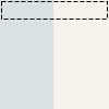
When repeated this forms vertical banding (stripes).
Second gradient
The second gradient is the vertical stripes running in the default direction.
Direction Default:
If no angle is provided, the gradient goes top to bottom (0deg).
Colour Stops:
- 0% - 50%: blue
- 50% - 100%: transparent
The result is a horizontal bar of colour on the top half, and a transparent bar on the bottom half.
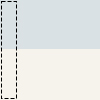
Repeated this forms horizontal banding (stripes).
Together
When you stack them as separate background layers and add a background-size:
You get:
- Layer 1: vertical 50/50 split
- Layer 2: horizontal 50/50 split
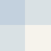
Repeated, these two overlapped layers create a grid or checker pattern. The overlapping blue parts make a cross pattern; the transparent parts show the background colour below.